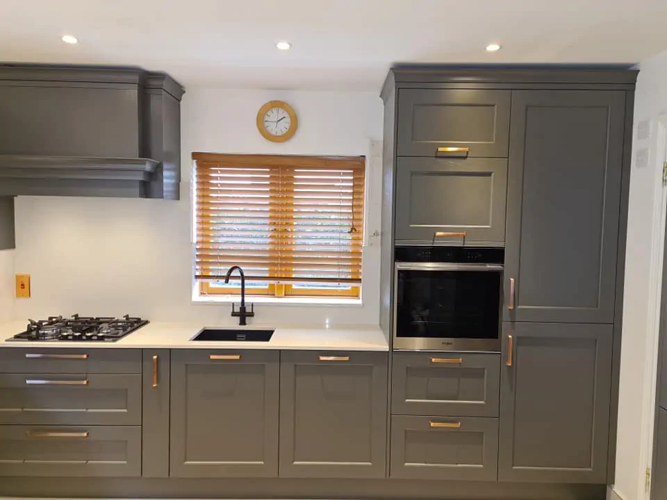
Colour is the decision clients agonise over the longest, and understandably so. A door style can be described in a sentence, but a colour has to live with you through grey January mornings and bright July evenings. At Creo Interiors we hand-paint and spray-finish cabinetry in whatever shade a project calls for, which means the palette is genuinely open, so the real skill lies in narrowing it down to the tones that will still feel right in ten years.
Start With the Light, Not the Paint Chart
Irish daylight is soft and often cool, and it changes a colour dramatically between morning and evening. A shade that looked crisp in a showroom can read flat and chalky in a north-facing room, while the same colour in a south-facing extension can feel warm and generous.
Before committing, we always recommend the same exercise:
- Get a large sample board — A4 minimum, painted in the actual finish, not a printed swatch.
- Move it around the room across a full day, including under your evening lighting.
- Hold it against your flooring and worktop, since those two surfaces set the temperature of the whole space.
Cool greys beside a warm oak floor can look slightly at odds; a greened-off grey or a muted clay tone usually sits far more comfortably.
Palettes That Suit Contemporary Kitchens
Modern schemes tend to work best when the colour does one job very well rather than three jobs adequately. Restraint reads as expensive.
Warm neutrals — mushroom, stone, and putty tones in a matte lacquer give handleless runs a soft, architectural calm without the coldness of pure white.
Charcoal and graphite — dramatic across tall units, particularly when broken up by a lighter island or a veined quartz splashback so the room never feels heavy.
Textured woodgrain — a walnut or smoked oak section against a painted run adds warmth to a minimalist scheme and stops it feeling clinical.
Colours That Bring Traditional Kitchens to Life
Painted Shaker cabinetry is where colour really earns its keep, because the frames and panels create shadow lines that give a shade depth. Sage and olive greens have become a favourite in our Celbridge showroom, especially paired with brushed brass handles and a pale worktop. Deep navy and inky blue work beautifully on an island against off-white perimeter units, and softer creams, muted whites, and heritage greys remain the safest choice for period homes where the cabinetry should feel like it has always been there.
Two-Tone: The Approach We Recommend Most Often
Very few of our kitchens are painted a single colour. Splitting the scheme — lighter above, darker below, or a feature colour reserved for the island and larder — makes a room feel taller, hides wear on base units, and lets you be braver without overwhelming the space. It also gives you an easy route to refresh things later, since repainting one island is a far smaller job than repainting an entire kitchen.
Kasia and Tomek will usually walk clients through three or four sample doors side by side rather than a chart of fifty options. Narrowing the field early is what makes the final choice feel obvious instead of overwhelming.
Let's Find Your Colour
Whether you're drawn to a quiet contemporary neutral or a rich painted Shaker in deep green, our in-house joinery and spray-finishing team can match it exactly.
Contact Creo Interiors today to book a design consultation, and bring your flooring and worktop samples with you — we'll do the rest.